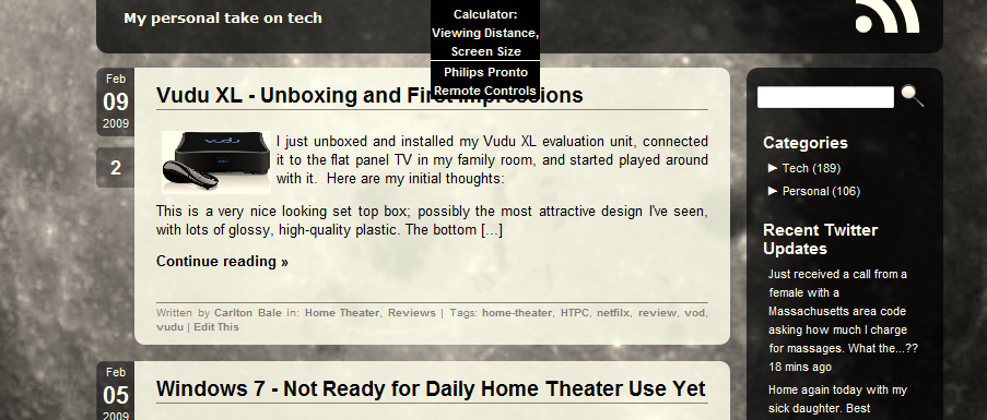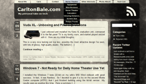
 I just implemented a new theme on my WordPress website. I’ve been wanting a new design for well over a year but couldn’t find what I wanted: a simple design with lots of subtle transparency, rounded corners, and a simple color pallet. Then I found the Aeros theme (created by Joe at TheBuckMaker.com blog) and it provided a great starting point — but some modifications were required.
I started off by prepping my site content for the new theme. Using the P2Pconverter extension, I converted many of the old and outdated pages into posts to unclutter the top page navigation bar. Unfortunately, WordPress does not automatically forward the old page URLs to new locations. Instead of manually forwarding each URL, I decided to take a hit on search engine traffic and let the search engines find and index the new locations. Google, at least, has already adjusted their links.
I then did some work on the theme itself. The top javascript navigation bar was overlapping long page titles in the drop-downs for sub-pages. Also, the sub-page background was transparent and that made the text difficult to read. So I edited the Cascading Style Sheet to use automatic height instead of fixed height for the sub-page “cells” and changed the cell background color from transparent to black. I also added white lines to the top of each cell to provide visual separation between them.
Next, I made some changes to some of the colors and hover effects to suite my tastes. I then modified the footer to include copyright information. I abandoned all of the custom code I used to have in the right column and decided to use only Widgets because they are easier to maintain. I also added code so that all of my comments are highlighted in a different color than other comments (thanks .) Finally, I modified the main page to show post excerpts instead of full posts.
Because the new theme works with threaded comments (so you can reply to other comments), I enabled that feature in the WordPress admin panel. Other improvements include displaying tags at the bottom of each post and Gravatar pictures for each user next to their comments.
In the future, I may adjust the content width and add an additional widget-bar along the bottom of the page.
The downside of the new theme is that it is extremely inefficient compared to the old design. It uses a lot more javascript, many more small images, and a very large background image. I plan on slowly optimizing this in the future, but I decided the new theme was enough of an improvement to take a hit on page load times for now.
If anyone has feedback or suggestions, I’d love to hear from you.
Looks nice Carlton. Simple and clean – I like it.
I like it too. Very nice.
It’s a good clean theme with plenty of plus points to make it worth of the change
Hi Carlton:
I think your website is great and simple. I am new to this so just bear with me o.k. I want to thank you for the graphs and explanations about 720p and 1080p. I am strongly thinking of buying a 32″ to 37″ HDTV but there are so many to choose from. I have been use to buying Sears products and they have this television called “Spectre” brand HDTV. From what I see the picture clarity is great. I would like to know how would you rate this brand as opposed to Vizio, Aquos, LG, Panasonic or even Sony. Also, how is the picture clarity when you purchase one with the built-in DVD player? I respect your opinion and will give high regard to your answer.
I don’t have a strong brand preference; buy what you think looks best and fits your budget. I prefer screens with a matte finish instead of a glossy finish as they have less glare. No need to see your own reflection in your TV; that’s what mirrors are for. I wouldn’t purchase a TV with a built-in DVD or Blu-ray player. You generally get the lowest cost components possible, and if one goes bad, you have to replace both. I think your money would be better spent on a sub-$100 stand-alone Blu-ray player.